Monday, July 1, 2013

Models in ads (panorama)


the sky seems to be different on the left as well with the levels and horizon line.  It seems like a bad attempt at a panorama.  The photo editing on the models is very good although the females are made out to be more tan than the man.  The use of wind gives the photo some movement like we can relte to the wind blowing through our hair.  Not really sure what this ad is representing but photo wise could use some work.

Panorama


Images that are larger like this can be used as headers and are great for advertising and marketing for your business.  The clouds in this pana are begining to get washed out as they enter the right side of the picture.  The levels work between the water and the rocks look on point except for maybe the green.  I would have done a different crop on this image though, i would have cropped it so it has more sky showing than water.

Portrait


Using your surroundings is a good way to get the perfect picture for that shot like an album cover, there is alot going on but this looks like it could be used for an advertisment in a magaxzine for music, clothing, or sunglasses.  Its urban, its eccentric.  The levels are YELLOW.  people dont think about leveles to much in the real world it seems to me.

Wedding Photography (portrait)


when i think of photography one of the first businesses affiliated i think about is the wedding photo feild.  This is one of the largest profit areas for photographers.  Every wedding photo is a portrait though, unless the bride and groom are super adventourous, but still that doesnt leave much room to work with.  When i see a portrait i want to see things like, flawlessness in every corner nook and cranny, the overall portrait of the bride is basically the one time in her life where she actually shines like a quee, the photographer got a great shot here with the sun angle lighting up her vail.  the levels in the bride are a bit red, the background very yellow

design company


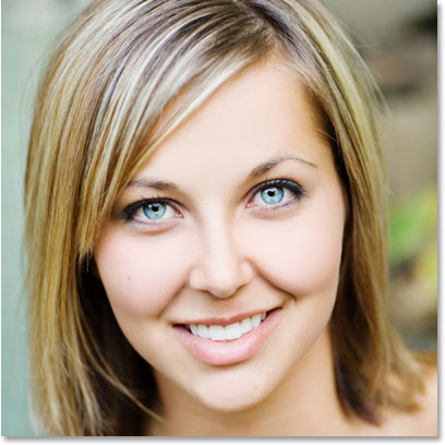
This is a clean photo with goo editing on the skin healing, and skin tones.  the lip looks a little bit too red and the overall picture is very blue.  The teeth do look a little yellow as well, im not sure why these colors were picked but they are not working.  the skin is popping to much its so bright. turn it down.

self portrait


I think this reflection really gives the portrait a different side to how the photographer is displayed.  I dont think any levels work was done here at all everything loos red and orange, maybe the intent but it looks muddy.

Model (photoshoped)


The teeth look a bit blown out, the shadow on her left cheek is dramatically greater than the other side.  The eyes and teeth are too bright it almost looks unnatural to the point where i want to look away.  I think the skin has nice midtones on her left temple, from there on everything else ets to bright and to much of the same color.  Almost sickly. i do think the hard crisp edges on the cheeks are a plus to the picture, they add depth.

Photoshopped Babies (is Creepy)


When you take it to far in photoshop it shows, the natural curves of this child's face are lost with the opacity being much too high on the digital make up added to this babes face and features.  I think the corrections done to the Hat need to match the torso piece, and the eyes are so bright that this kid looks like it was transformed from real, to a PLASTIC childs doll.  This is why peoples perceptions are so messed up/.

Hollywood make up (Cameron Diaz)


Photo corrections in hollywood should be top notch for what is getting paid, when i look at cameron diaz on the right i see alot of green in the hair and in the shadows.  If the editor would have went back to check this they would have also noticed that her left eye is completely black, the shirt also gets lost, when the levels and or brightness were tweaked they went to far so that now i can not see the lines in her shirt.  All it looks like is she rolled around in foundation.  the artist also made her face slightly skinnier.

David Alvarez


These are some of the most importnat photos a photographer can get his hands on.  I always notice that the photos done in professional sports are of some of the highest quality   I think he could have focused on getting more of the glare off of the are facing the viewer.  I am also losing half of his face into the shadows.

Photo ad by Shweta' Photography


I think the levels in the child on the left are pretty good, but tmaybe a hint of red is showing.  The film going across the top and diagonally through this photo ad are throwing me off, i would have only one thing of film going across the top and possibly making thumbnmails to fill in the rest of the open space, mabe thumbnails that hit a certain feild or category of Shweta's Photography.

Markus Reugels

Photo by Marco Ryan: black-and-white photo
This picture caught my eye because of the mystery it holds.  Fingers are comming through what looks like a bee hive type structure or fence.  the condition of the hand makes me think that this is in a third world country, also because of the Camel watermark on the bottom left.  I think the blur mught be a little heavey off to the left i get lost when i look in that area.  there is a lot of blues and white that the midtones need to be worked on.

Dan Cuellar and Isabel Heidinger “Awayting the Storm”

Photo by Dan Cuellar and Isabel Heidinger: a child listening to the piano
The clouds look like they had the dodge tool used too much in one spot above the umbrella to the left.  It almost looks like there is a shadow behind the umbrella which leads me to believe that there is a green screen behind the subjects.  I see aot of red in this picture. And i have come to the conclusion that this is a green screened set, it looks to fake

Wojciech Grzanka

Photo by Wojciech Grzanka: surreal photo manipulation
I think the photographer has a strong meaning behind this piece of work, and behind all their work.  This photo is enough to take in.  it can relate to anyone, everyone has a darkside that they only know, that is what this photo describes, or it could be a meaning of being tied down, as if you were a tree of the earth just there aging and rotating with the earth.  the use of levels have this image looking even darker than it portrays.  Make up on the model really makes the job easier on the photo editor to.  the costuming and set, or real life look real enough to be fake but so real fake isnt an option.

Ansel Adams

famous photographers
I really have to respect the work in front of me here. given the year the photo was taken there was no photoshop to use, only film and chemicals.  If they had photoshop this photographer would be the one providing wallpapers for standard use by huge companys.  I would use levels to focus on the trees and clouds.  the clouds floating at the base of the mountain look cool already so they would be easy to upgrade.  I would also bring forward the waterfall by darkening behind it and brighting the falls themselves.